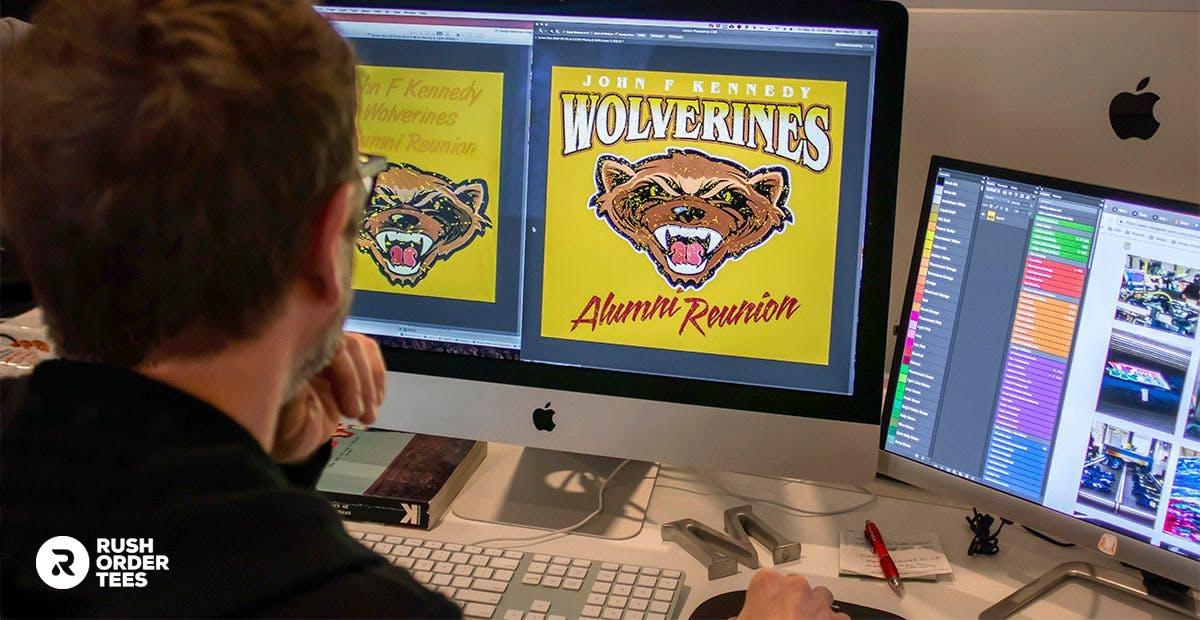

Many of us have been there: up late at night working on a design you can't get to look right. Or maybe you have sat in front of our Design Studio and found yourself drawing a blank, deciding on what direction to go in the first place.
Design can be a challenge. Whether it’s placing an image, choosing fonts, or rearranging a layout, even those of us who do it for a living can get stuck.
Sometimes all you need is a little inspiration. And some real examples.
In this article, we'll look at 15 examples of actual designs that came into the Art Department and needed some graphics help. At the customer's request, I gave them each a design makeover. It's like "Pimp My Ride," but without installing a fish tank in your car.
Are you ready to learn awesome tips and tricks to improve your T-shirt designing skills?
1. Dougie Fresher
First up, this design came in for a fundraising event, and it has some issues. I'll go through them one by one, but first: what do you think could be improved?
Before:
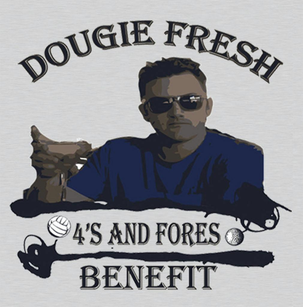
Here are the issues I found:
• Did someone turn off the lights? Overall it's dark, drab, and has low contrast, causing some elements to blend together, such as his hand holding the martini glass. And his face is mostly in shadow.
• Those black blobby things– what are they? Ink splats, I presume, but why? The bottom one looks like it's trying to be a golf club to go with the golf ball. But it's not quite there.
• Speaking of that ball, why would the volleyball be the same size as the golf ball? I've heard of mini-golf, but mini-volleyball? It adds confusion for no reason.
• The font choice "Algerian" doesn't go well with this design. Or any design. Recently, Yards abandoned it. The font is awkwardly fancy (it's in the "decorative" category) and has tiny lines that don't print well.
• The image is squashed. It happens when you don't scale proportionally. In other words, changing a dimension (height or width) individually. Squashing people makes their heads look fatter.
So how do we fix these issues?
What I did instead of fixing the existing design was start from scratch. I spoke with the customer to request the original image of Dougie and learn more about the event. They told me it was supposed to be fun– so I had some fun with the design. Let's have a ball with this example.
After:
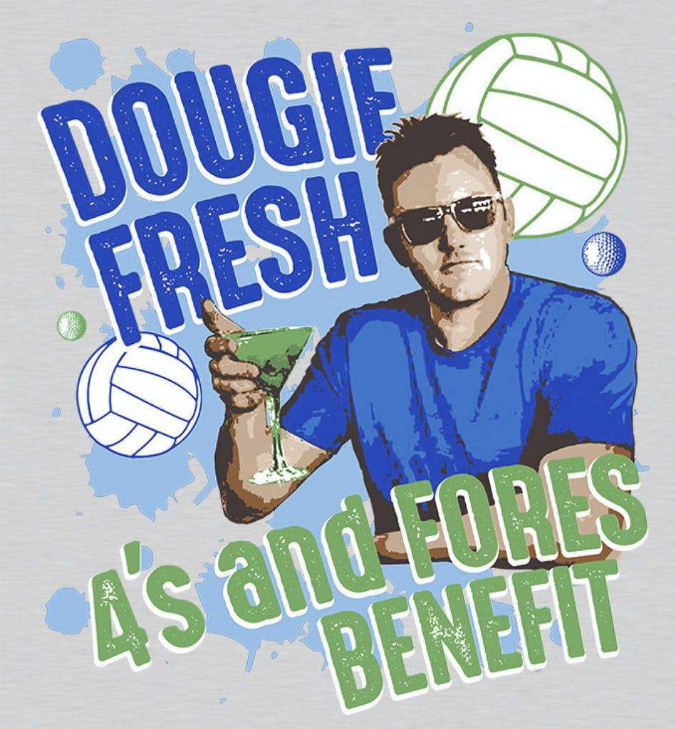
What exactly did I do?
• Added brightness, colors, and proper skin tone.
• Corrected proportions, so he's not squashed.
• Used a fun modern font and applied a unique angled arch.
• Got some new clip art balls and made their sizes relative.
• Changed the color of the drink for stronger contrast.
• Got rid of the uggo ink blobs. No offense to ink blobs.
• Added a blue background splash to tie it all together.
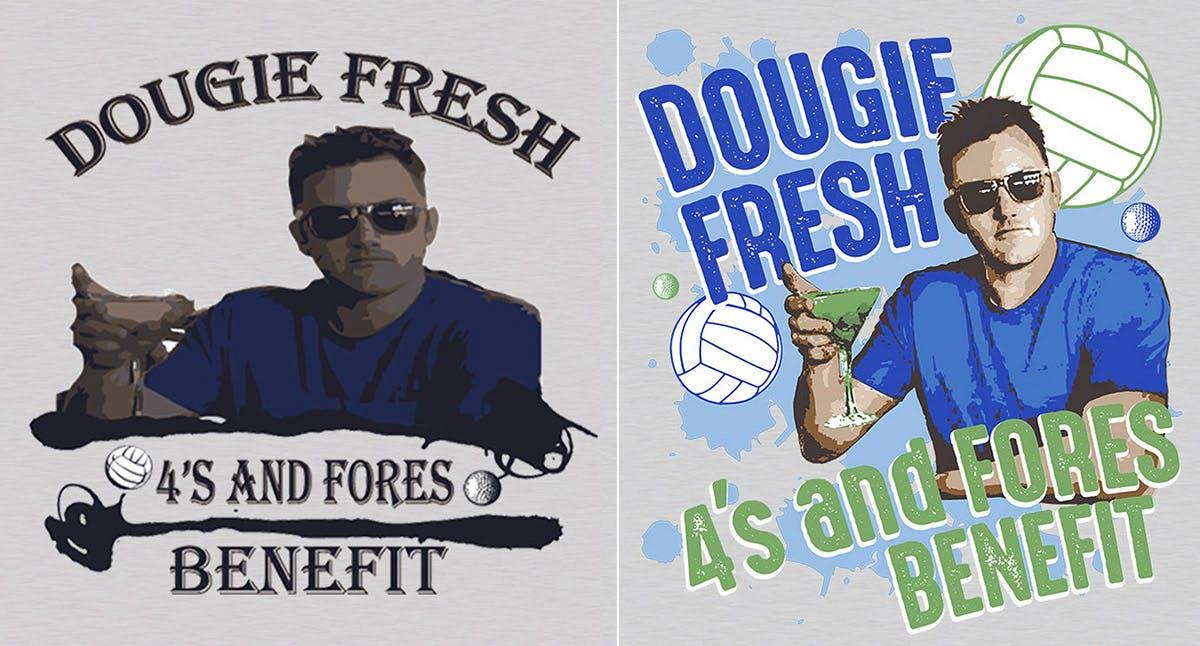
Customer approved. Design time: 45 minutes.
2. From Beast to Beauty
There's a small town in South Dakota where you can visit a Native American Reservation and kiss a buffalo. Ain't that America? They deserve a good T-shirt. But this ain't it.
What do you think?
Before:
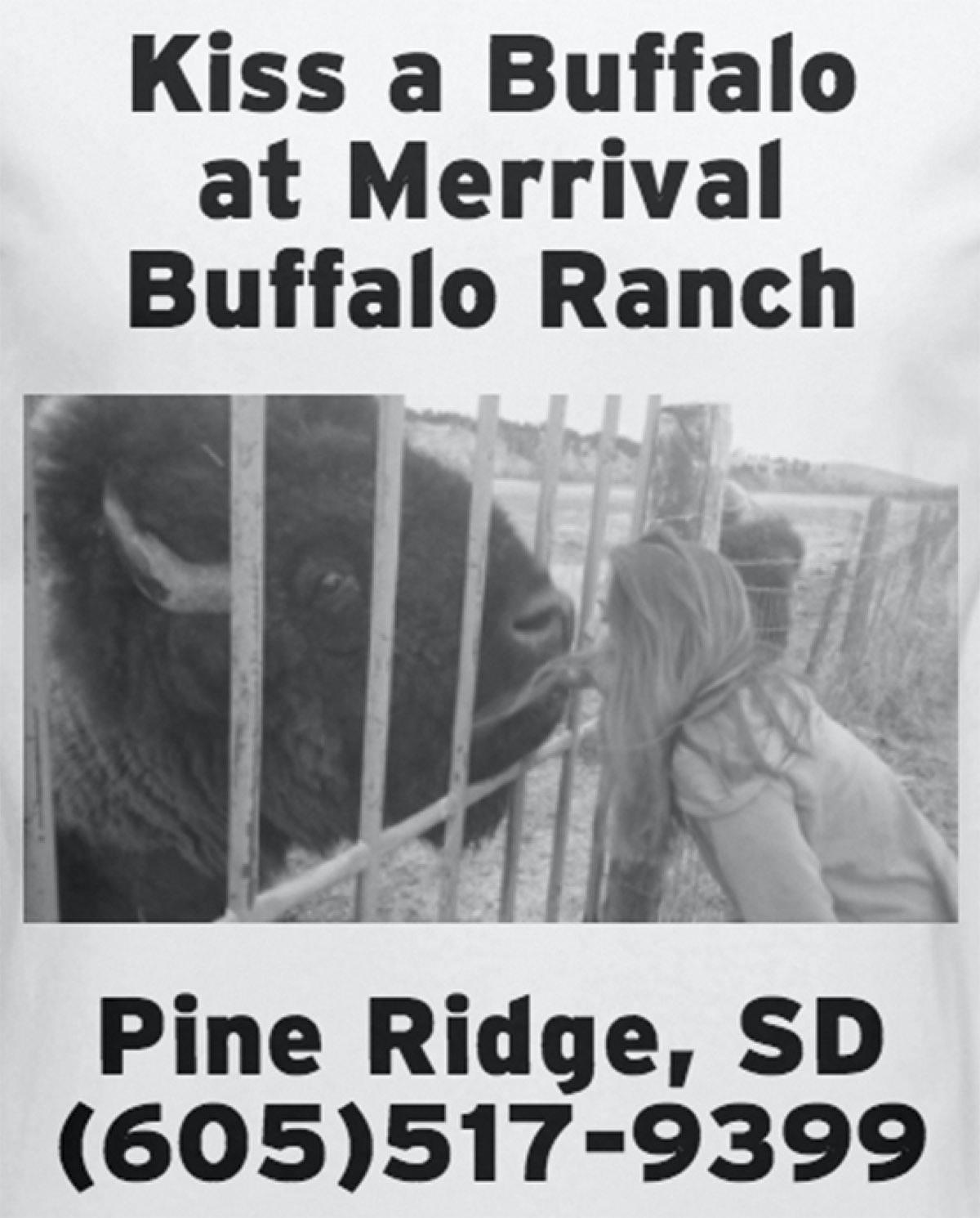
What did I see that could be improved?
• Basically, it's too basic. Type, image, type. Plain, standard font (it's literally the default font from our Design Studio), and every word is the same size. Looks like it took about 2 minutes (and probably did).
• The business's title, "Merrival Buffalo Ranch," should not have a random line break– it should be all one line. Or, you could do the top line "Merrival" (the name) and bottom line "Buffalo Ranch" (what it is), but the word "at" shouldn't share the line with "Merrival." This is a good rule to follow in general.
• The photo is blurry and has low contrast, which doesn't favor this image. Hard to know what's happening here. It's also not cropped well and has no border. Just looks slapped onto the shirt. Who remembers iron-on? Those had borders, at least.
• The phone number is way too big. I've always had a thing against phone numbers on a T-shirt. First, if you want the person wearing your T-shirt to look like a walking billboard, the way to do that would be to put a giant phone number on it. Second, does anyone ever write down a phone number they see on a T-shirt? I wonder.
These are not as many design issues as not having a design in the first place.
This customer wanted to keep their overall cost low, so we kept it one color: black ink on a white shirt. Nothing wrong with that. But they were interested in getting a design makeover. Let's cozy up to this example. Pucker up!
After:
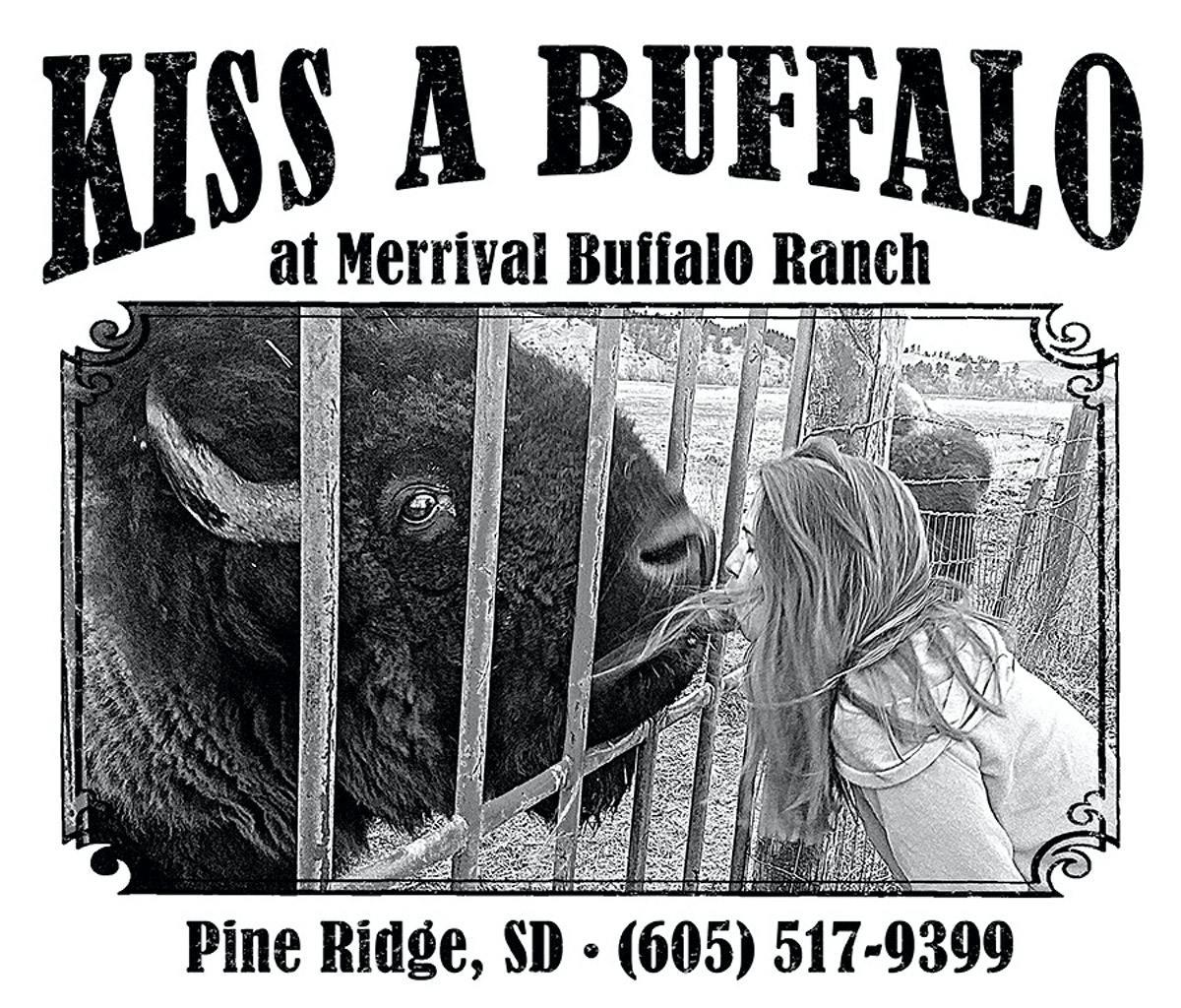
What exactly did I do?
• Chose a font that worked for the subject and gave it some variety of size and style. The prominence of "Kiss A Buffalo" works like a headline to grab attention. The location, and yes, the phone number is still there, just smaller.
• Adjusted the photograph to be sharper and have better contrast. Used Photoshop tools strategically in some areas. You can actually tell what's happening. Doesn't explain why it's happening; I'll leave that for you.
• Cropped the photo to frame the subjects and added a fancy border. A running joke in the Art Department was I would always say, "Put a border on it." The reason I always said that is because you should.
• Added a "distressed" texture to the type and edges. A distressed effect gives an aged, worn look, which I feel works for this design. For more details about that and how to use it, read my recent post all about it.
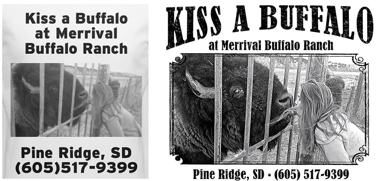
Customer approved. Design time: 30 minutes.
3. Lightning Round
AP Lightning is a US Military installation used by Task Force Southeast to train the 203rd Corps of the Afghan National Army and the 303rd Afghanistan National Police Zone Headquarters. That's right: these T-shirts would be heading into a war zone.
Over here in the comfort of our Philadelphia headquarters, we had a much easier battle: a design makeover. Let's attack this example.
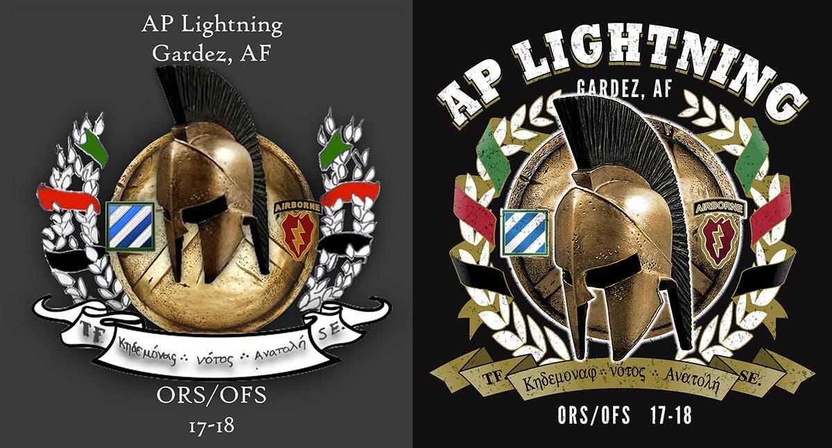
Before:
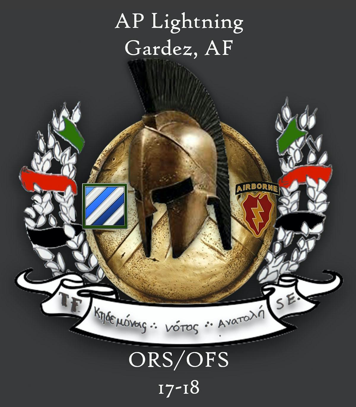
What this customer submitted was the digital equivalent of a napkin drawing. Charming but not intended to be printed as is. We get orders coming in this way fairly often, and we encourage you to submit your artwork in whatever form works best for you, including napkin drawings.
The concept is great, and the customer was excited to make improvements, so it was a perfect candidate for a design makeover.
So how did I go about this?
Essentially I needed to rebuild the design with all new parts. The resolution of this image is way too low: 72 DPI, and not even at full size. Ideally, we want it to be 300 DPI at full size.
So my first job was to find all the elements we needed at a higher resolution. We use a combination of resources: stock photo and clip art websites and our extensive clip art library.
What exactly was I looking for? The main parts.
• The Laurel wreath: a symbol of victory or achievement dating back to ancient Greece. This particular wreath would need custom ribbons going through it.
• The battle-worn Spartan helmet and shield: I knew I could find these popular and iconic images on stock photo websites.
• The military logos: Also easy to find. Often times there are high-quality versions of these on their Wikipedia pages.
And what exactly would I be creating myself? Everything else.
• The custom ribbons going around the Laurel wreath.
• The banner that runs along the bottom of the design.
• The typography, including the Greek type on the banner.
• The Photoshop layering, effects, and color separation.
It was a heated battle, and in the end, we were victorious.
After:
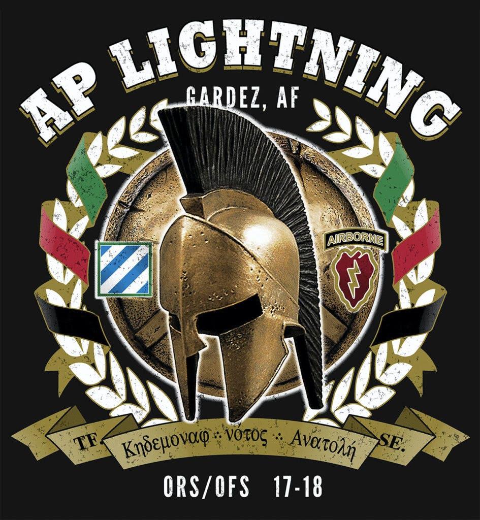
A few extra design elements that I added:
• A 3-dimensional look for the custom ribbons on the side.
• Bold, arched type hugging the top of the Laurel wreath.
• A glow around the helmet and shield for better contrast.
• Minimal shading and highlights on all the created elements.
• Inverted arch for the banner across the bottom.
• A distressed texture for a battle-worn look.
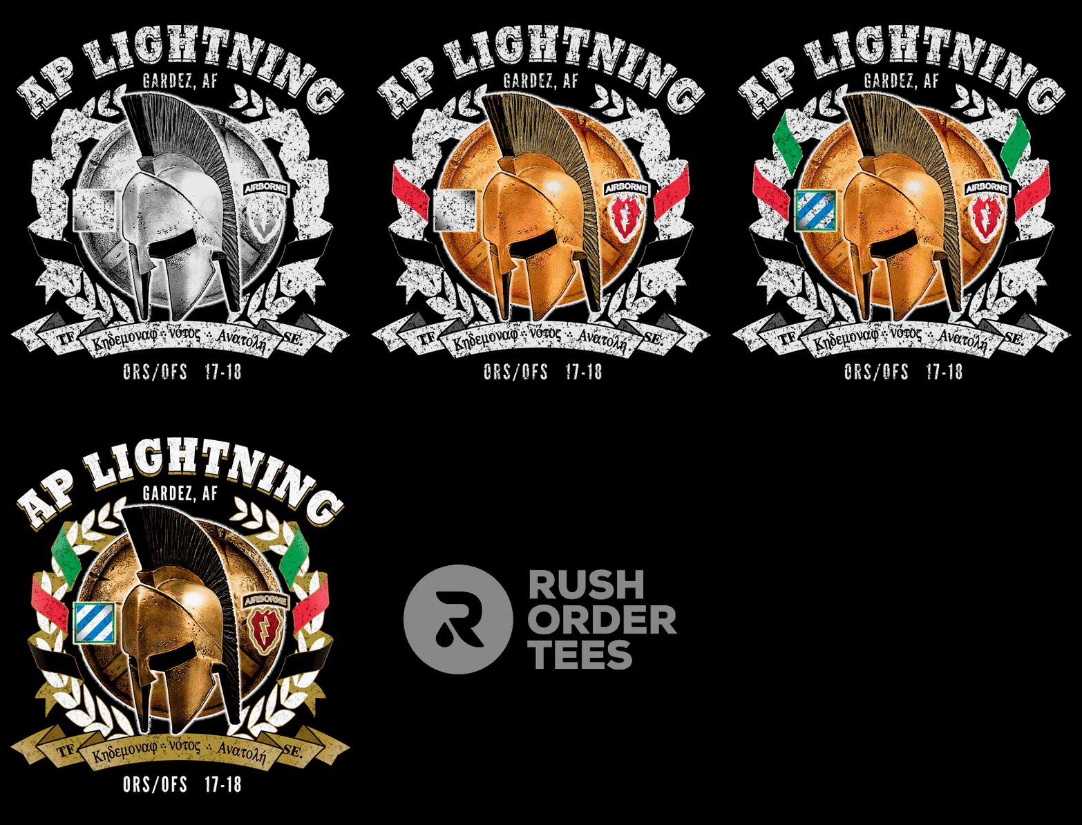
Once the design is completed, it's time to do the color separation. This particular job was to be printed in 7 colors. A separation of this kind is called "simulated process" and uses halftones. It can be tricky and time-consuming, so we'll save that for another post.
Like a cooking show, I'll jump ahead to the finished product.
This is a print preview of the colors going down in the order of the screens: white underbase, yellow, red, green, blue, gold, black, highlight white:
Despite the delays in communicating with someone on the other side of the world, the job was done on schedule, the customer was a breeze to work with, and she absolutely loved the result.
I asked her to tell her unit that we thank them for their service. She told me they thank us for ours!
Customer approved. Design time: 2 hours, 30 minutes.
4. A Walk in The Park
This art file was sent to us for a T-shirt order; I'm not sure where it came from. Possibly an old postcard. According to my Google search, Maryhill State Park is a beautiful campground in Washington state. What's really cool about it is there's a full-scale model of Stonehenge!
Too bad this graphic has some serious problems. I'll go through them one by one, but first: what do you think could be improved?
Before:
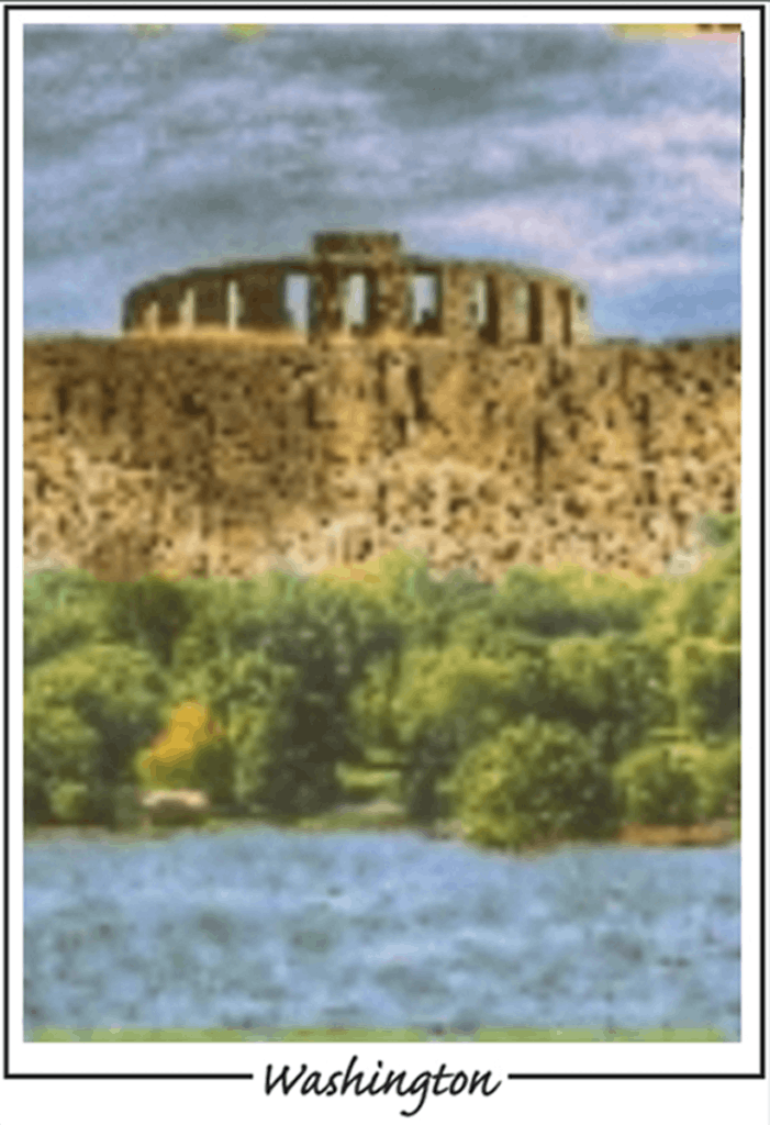
Here are the problems I saw:
• It's super blurry. It's the view after you've had about eight beers. And there's no booze allowed in state parks, people. A print can only look as good as the original image, so if you start out blurry, you'll definitely end up blurry on the T-shirt.
• It's odd-looking. Not sure how else to describe that. Muddled? The water and the sky kind of look the same. The trees are bright, but everything else looks shadowy. Wait, is it trees or broccoli? Hard to tell.
• The edges are all janky. My spell check says janky is good to use. Wasn't sure. Anyway, the lines around the border are neither clean nor straight. And there are some random colors just hanging out along the top edge.
• The name of the park is missing. Maybe it floated down the river?
So how do we fix the problems?
You are correct if you guessed that the best way is to start from scratch. I spoke with the customer to get a better idea of what she wanted and let her know that the art file provided was a non-starter.
The customer explained that she wanted the design to look like an old postcard, on a forest green T-shirt, with the park name prominent. That I could do! She agreed to a design makeover, and I went to work on it. Let's take a trip through this example.
After:
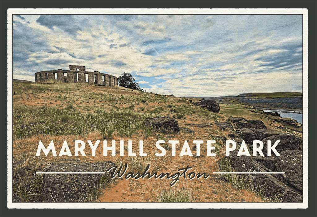
So what exactly did I do?
• Searched for and found a photograph that would work.
• Cropped it for optimal visual appeal, with the subject offset.
• Adjusted the colors, sharpness, and contrast for a clear print.
• Chose a modern font with a retro style for the park name.
• Added a thin black outline to the border for a clean edge.
• Created a distressed outer edge for an aged postcard look.
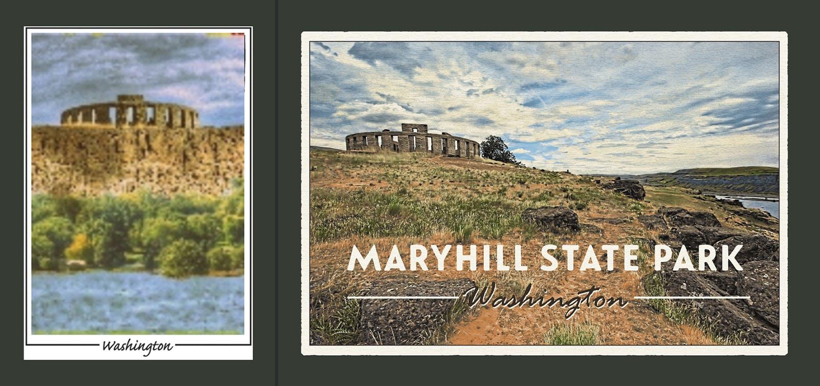
Customer approved. Design time: 60 minutes.
5. Semi Designed
Here's one I knew needed help as soon as I saw it. Although we get designs coming in like this all the time, it doesn't have to be this way. With a few simple improvements, something like this can go from bad to badass. Read our article about designing company T-shirts for more in-depth advice.
The design has obvious issues. I'll go through them one by one, but first: what do you think could be improved?
Before:
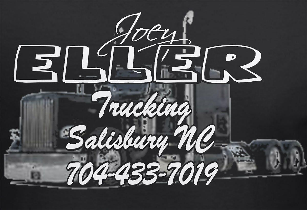
Here are the issues I found:
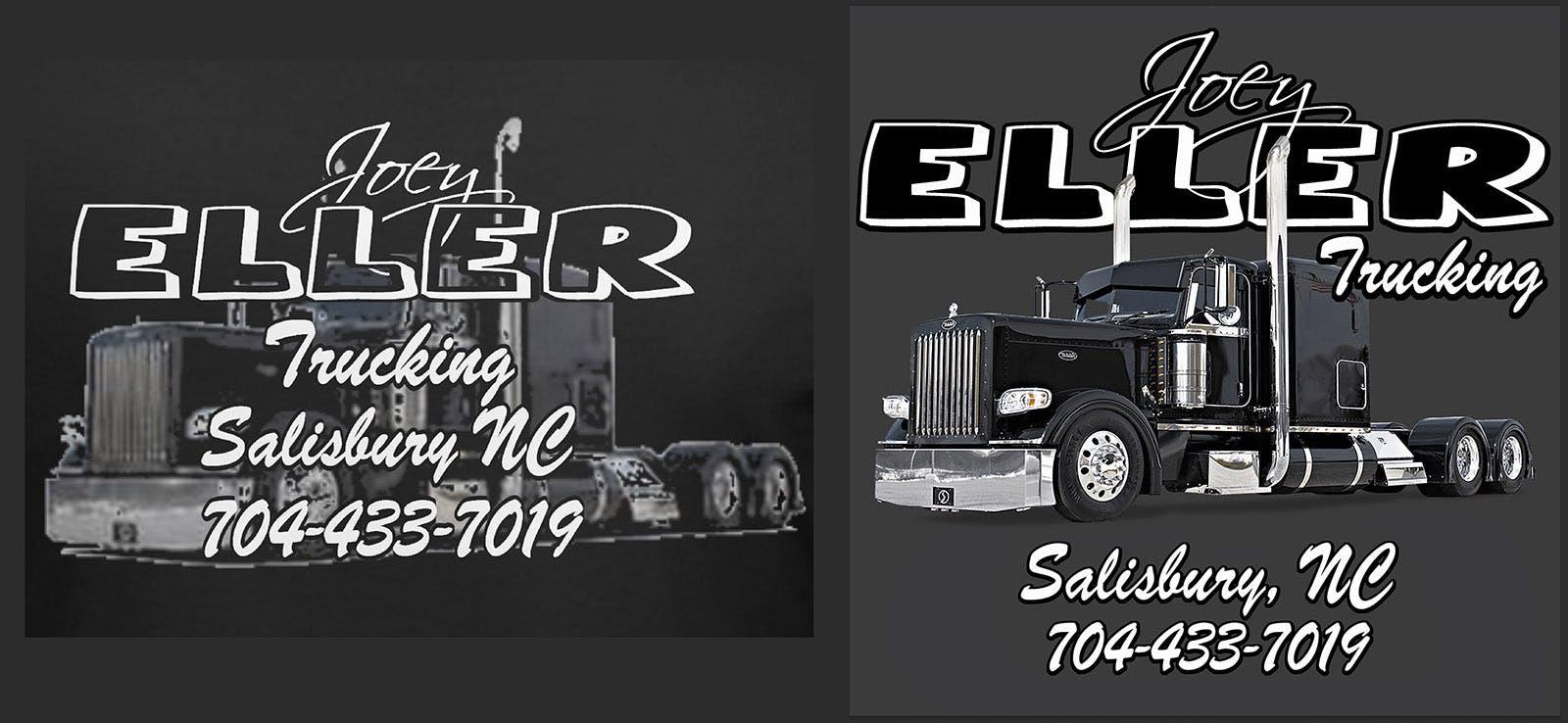
• Is there a truck behind all the type? It looks like there might be a truck. This is a typical design mistake. Overlapping things is good, but completely covering the subject is not so good.
• The truck image is very poor quality. It's low resolution and blurry, with pixelated edges and weird coloring. There seem to be big chunks missing in various places. I'm not sure this truck would get very far.
• The typography needs work. Notice how it reads "Trucking Salisbury NC" altogether. There should be some visual distinction, so the viewer knows that the city is not part of the business name.
• You don’t need a giant phone number printed (does anyone actually write it down?), so I'm listing that as an issue, even though we ended up keeping it on the customer's request.
So how do we fix these issues?
Unlike other designs in this series, I didn't need to start from scratch. I wanted to keep the customer's logo, font choice, and general concept intact. But he was happy to get a design makeover, so I got it in gear and got to work. Let's roll.
After:
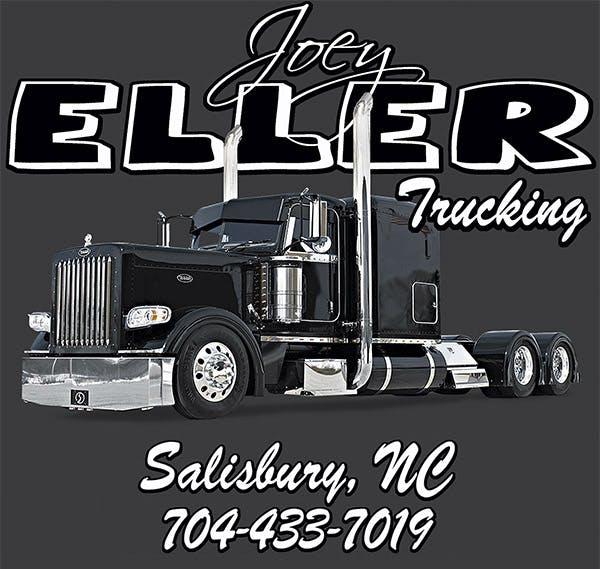
So what did I do?
• Found a great, high-resolution version of the exact truck.
• Created a realistic shadow underneath the truck.
• Adjusted the colors, sharpness, and contrast for a clear print.
• Moved his logo up and behind the truck for a 3D effect.
• Moved the word "Trucking" up to be part of the business name.
• Filled the "Eller" type with black for a better look and contrast.
• Moved the city and phone number down. Added the comma.
• Erased leftover edges around the image for a nice clean print.
Customer approved. Design time: 30 minutes.
6. Wolverines!
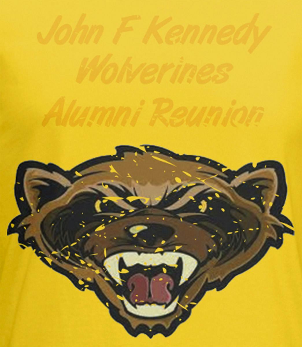
This artwork was created in our Design Studio, and you can see the distress effect that was applied there. The design is pretty basic and could use some improvements. It also has one major problem.
What do you think?
Before:
Here are my issues with it:
• This is an example of the dreaded belly print. A belly print is any design with a subject, focus, or "weight" lower than the chest. It's not a flattering look on anyone. Unfortunately, it's a common mistake. I explain it in-depth and show you how to avoid it here.
• All the type is stacked together and sized the same. For the reader, it's not clear what is being emphasized, and it's plain. Looks like it was just typed in and left like that. So rather than a design problem, it's more like a lack of design. Which is a problem.
• The Wolverine graphic is low-resolution. You can see the pixelation and the patchiness in the colors. The soft edges don't lend themselves well to printing, as blurs become halftone dots, making otherwise clean lines look jagged.
• The distressed effect is too big and chunky. It's our default distress texture, which can work well on many designs, but it's a bit much here. Looks like an actual wolverine attacked the shirt.
So how do we fix it?
This one needed a complete redesign. I checked with the customer to learn more about the event, and they were thrilled with the opportunity for a design makeover. I wanted to give them a T-shirt that could be worn more than once. So I got my head into the game and got to work. Let's take a look at this winning example.
After:
What did I do here?
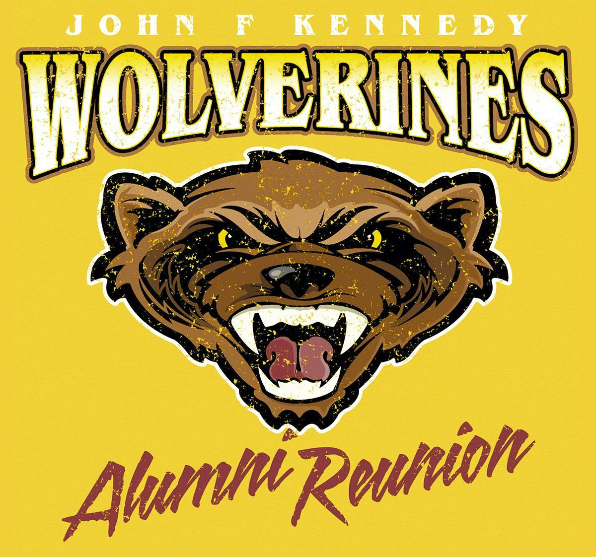
• Found a better vector version of the Wolverine clipart.
• Adjusted the colors for clarity and improved visual impact.
• Picked a good font for "Wolverines" and applied typographic style.
• Moved everything up to the chest to avoid the belly print.
• Moved "Alumni Reunion" to the bottom and used a different font.
• Added a more subtle distress effect to the whole thing.
Finally, this is a 6-color screenprint order, so a great separation was needed. This kind of separation requires an advanced technique called simulated process, which uses halftones to achieve a wider array of colors than is actually used. Here's a print preview GIF showing all the colors in the order of screens:

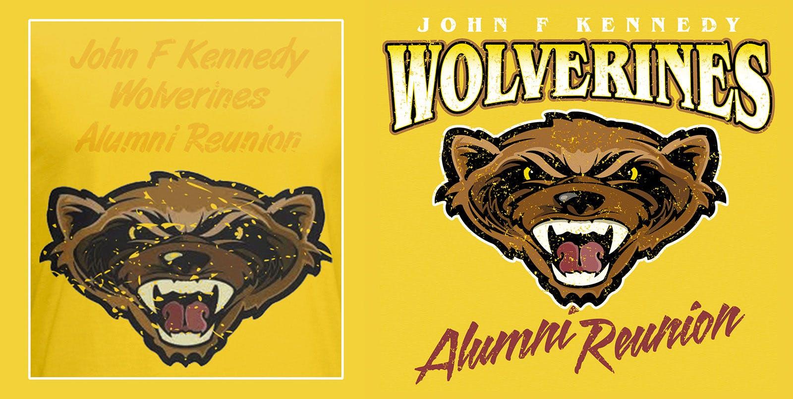
And the before-and-after. Can you tell I love before-and-afters?
Customer approved. Design time: 45 minutes.
7. If it Walks Like a Duck
Here's an image file that came through for a fairly large order. It's for some event in Tennessee where disgruntled ducks face off in the woods (I'm totally guessing here). This particular duck looks really angry. Aren't they known for letting things roll off their backs? Anyway, the design needed help, and so did the image quality. I'll go through the various wrong things, but before I do…
What do you see that needs to be fixed?
Before:
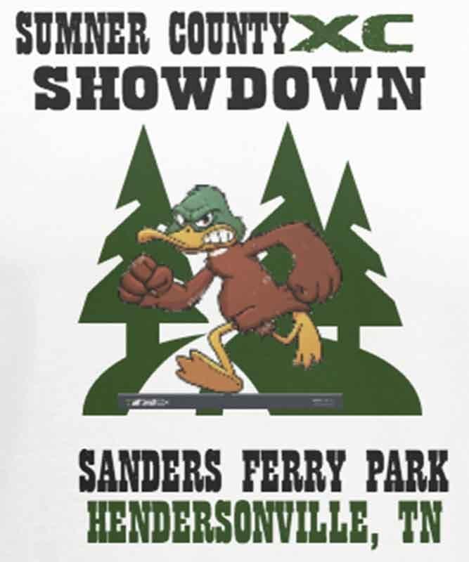
Here are the problems I saw:
• The duck is pixelated. The resolution of the duck is different than the background and text; you can tell by the fuzz and jaggy edges. The trees and text are not much better.
• The type is all over the place. Left justified, right justified, who cares, right? Why not both? Why not some in the center? Turns out, there are good reasons for not doing this.
• The proportions are off. The duck (subject) is too small, and the trees (background) overtake it. The trees look like a state park logo, but we'll put that aside now.
• There's a random gray bar. Ok, it's not so random. It comes with a piece of clip art when you get it with Google image search rather than paying a stock photo company. Tsk tsk.
So how do we fix the problems?
This is one where I had to start from scratch (although it could be in the category of a design "repair" in the sense that I would need to go get all the same stuff– just reassemble it in a way that works). The customer explained that this is a running group for elementary kids who race for a mile in the grass. So that's fun. She said she just wanted it to "look cool and tough." That I could do. Let's walk through this example.
After:
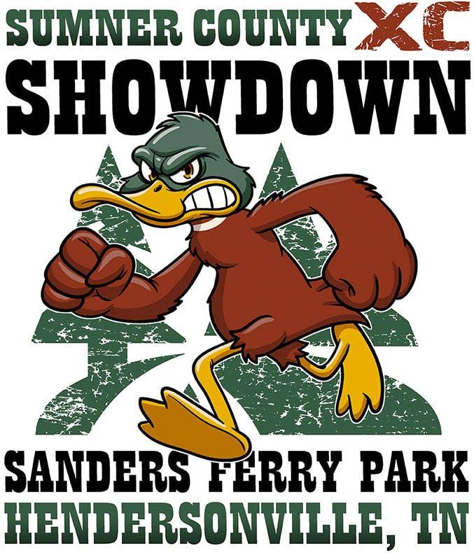
So what exactly did I do?
1. Purchased the high-quality duck image from a clip art site.
2. Increased the size of the subject relative to the background.
3. Aligned all the type in a good way and made sense.
4. Bumped up the colors on the duck and changed the "X" to match.
5. Added a thin white outline to further contrast the duck edges.
6. Added a subtle gradient to the green type.
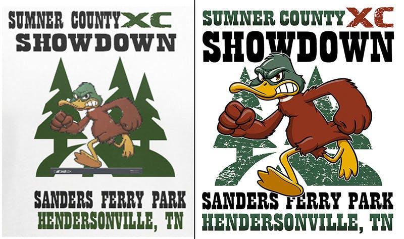
Customer approved. Design time: 30 minutes.
8. Elf Comes Up Short
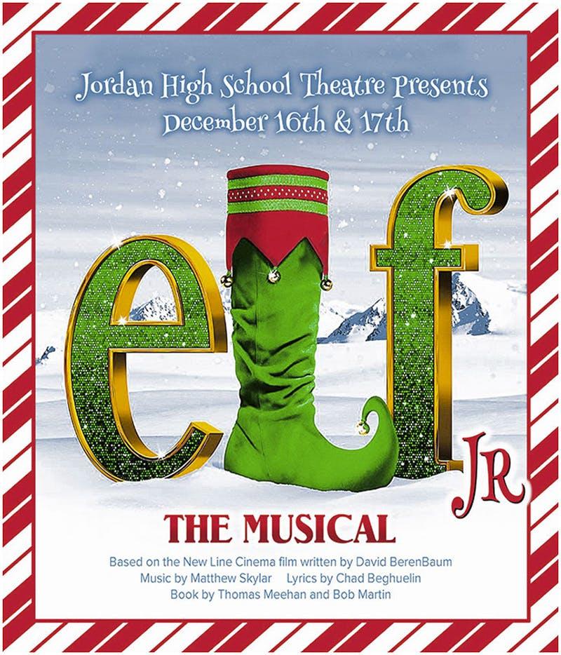
It was a cold day in late November, and this artwork came across my desk. The candy cane frame had me feeling the Christmas spirit, but after a closer look, turns out both the image and the design belong on the naughty list. I'll go through the reasons why, but first: what do you think needs to be improved?
Before:
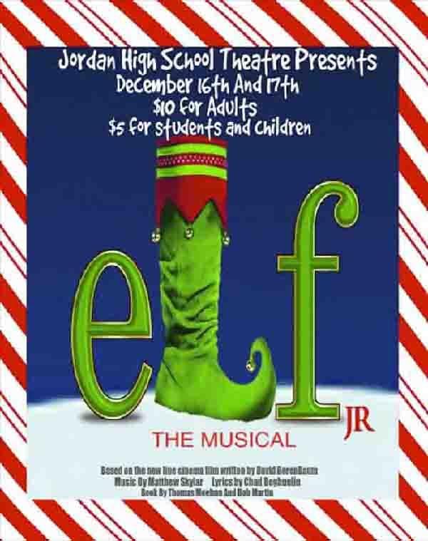
Here are the issues I found:
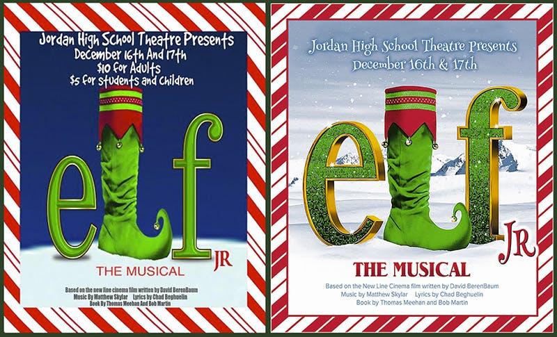
• Low resolution, lots of artifacts. Poor quality image from top to bottom. You can see jagged edges and digital artifacts from high compression. I can barely read the type on the bottom. Ok, some of it I can't read at all.
• This is clearly the poster or flyer design. Why would you want to have the ticket price on the T-shirt? (Hint: you don't). The T-shirt (or any merch) design should be different from the promotional materials.
• It's boring. Not to be a Grinch, but overall the design is blah. Plain blue background, the title looks like it's just standing out in the slushy snow on some street corner at night and is missing a boot.
So how do we fix these issues?
You are correct if you guessed that I needed to start from scratch. After some Googling, I found various better versions of this Elf Jr. The Musical graphic floating around, and copyright was not an issue because this is for a school (educational purposes).
I spoke with the customer, and they were open to an improved look; they just wanted to keep the candy cane frame. Sure, why not. So they agreed to a design makeover, and I went to work on this example.
After:
So what did I do?
• Found a high-resolution version of the type and the boot.
• Added a North-Pole-like background landscape for depth.
• Added some snow and sun sparkles for a magical feel.
• Recreated the top type with a festive font, omitting ticket cost.
• Recreated "JR" and the bottom type so it's clear and legible.
• Created a candy cane frame with stripes pointing upwards.
Customer approved. Design time: 60 minutes.
9. Mo's What Shack?
What's blue when you cook them and red when you eat them? It's the Chesapeake Blue Crab. Maryland is known as the capital of these delicious creatures, but this artwork came from a place called Mo's in Virginia (close enough). When it comes to blue crabs, people cannot get enough of them.
The nice folks over at Mo's stopped cooking them long enough to order a T-shirt. Unfortunately, their artwork was not as high-quality as their crabs are. I'll go through the issues one by one and spend a little time talking about the back design, but first: what do you think could be improved?
Before:
Here are the problems I saw:
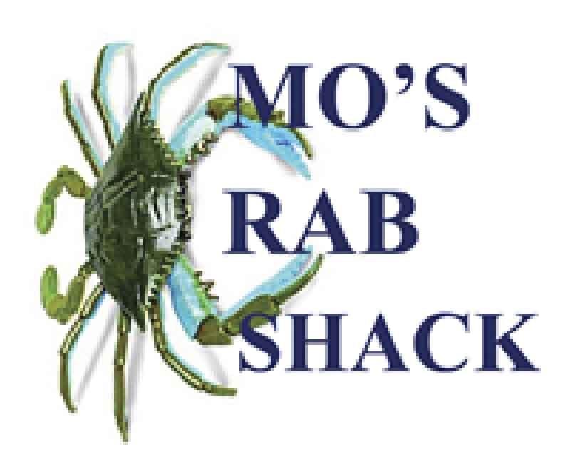
• The artwork is pixelated and low quality. This is par for the course, and there's a reason this is an issue that's always at the top of the list: if this wasn't a problem in the first place, we might not even do a makeover.
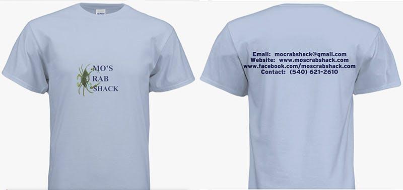
• The design makes it read "RAB SHACK." It's not clear the crab claws are supposed to form a "C," and I would put this in the category of a fatal flaw. The design failed if people can't get the name right or know what you do.
• The print is tiny and too low. A minor problem, but still a problem. Usually, people make their designs too big, but this is a rare case of too small– and too low. This is the easiest thing in the world to fix.
• The back is just a bunch of info. No image, nothing to grab the reader, and some redundant words for good measure. Waste of ink. I’ve always been skeptical if anyone has ever copied this kind of info from a T-shirt.
So how do we fix it?
Once again, I started from scratch but wanted to keep the same idea and make it work as intended. So I checked with the customer, and they told me that some of these tees would be giveaways, but some would actually be for retail.
I wanted to give them a T-shirt that could be worn with pride and didn't leave anyone scratching their head. So I jumped in with both feet and got crabbing. Err… cracking. Let's tear into this example.
After:
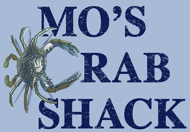
What did I do here?
• Found a better version of the same blue crab image they used.
• Adjusted the colors and sharpness for clarity and improved visual impact.
• Positioned the claw "C" where the type "C" would have been.
• Moved "RAB" over to make room for the claw "C."
• Added a shadow in the crab to give it some 3D depth.
• Added a distressed effect to the type for fun.
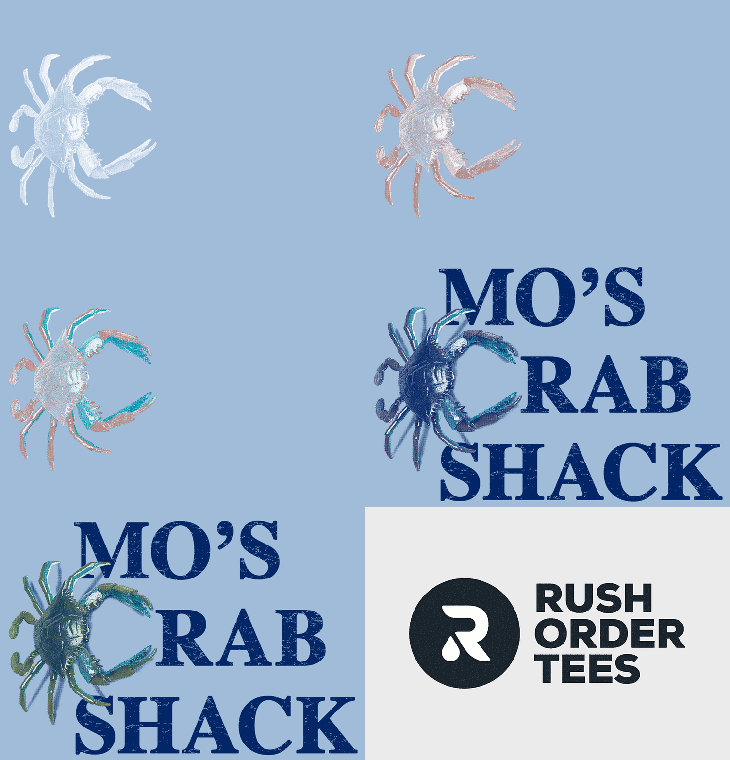
Finally, this is a 5-color "simulated process" print, so a great separation was needed. The look of these crabs is unique, but it can also vary between crabs. I wanted to capture the blue but also the greenish/brown. So I used a White underbase, a subtle Cardinal Red with a Light Lime Green on top, plus Navy. Here's a print preview GIF showing the order of screens:
Now let's look at the back print I made for them, a brand new design from scratch.
After:
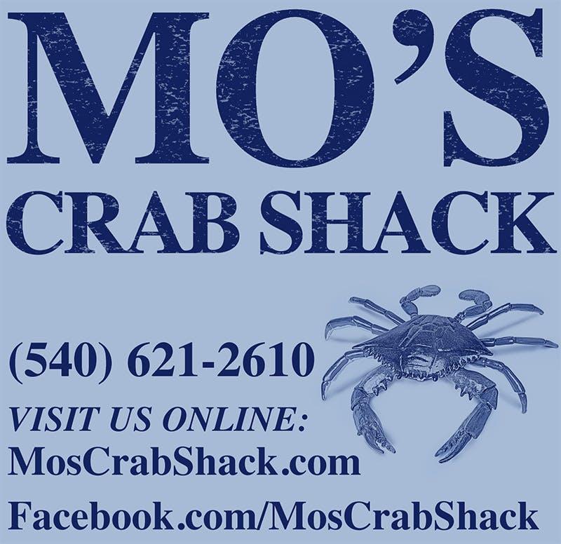
What did I do for the back?
• Used the same crab image to tie into the front but positioned it differently.
• This allowed me to make "Mo's" bigger and use the full name.
• All the redundant words and letters were omitted, condensing the info.
• Added a "call to action" (VISIT US ONLINE) to imply value.
• Used title case for the web and Facebook pages (it's easier to read).
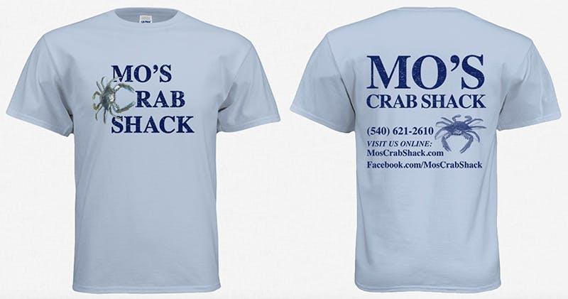
And the full before-and-after:

Customer approved. Design time: 45 minutes.
10. Think Harder
This next example is a job that came over from a student group at Kutztown University's Frederick Douglass Institute, which had a series of meetups throughout the year. So naturally, they needed T-shirts. (Everyone needs T-shirts.)
But what is going on with this design? While the concept is there– Frederick Douglass as The Thinker– it clearly needs to be more thought out. I'll go through the wrong things, but what do you see that needs to be fixed before I do?
Before:
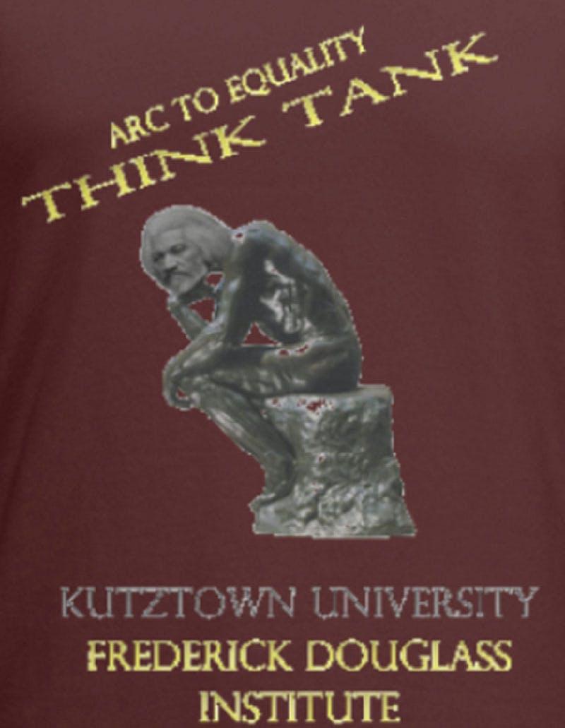
Here are the problems I saw:
• Everything is pixelated. Once again, the Art Dept's most common problem. The image, the text, it's all low resolution. You can tell by the jagged edges and the blurry features. It looks like The Thinker is growing an extra layer of hair all over.
• The top type is slanted for no reason. The title is haphazardly placed, seemingly falling from the sky. Looks like it's about to bonk Frederick in the head while he's busy thinking. And, uh… speaking of Frederick's head…
• The head is misplaced on the body. It's almost a horror movie happening here: there's just no way that head could be attached to that body. Guess his thoughts were so heavy he couldn't hold his head up anymore.
• The typography could use some work. A bit of everything, from sizing to centering to spacing, color, and proportions.
So how do we fix these problems?
For this one, I would need to start from scratch because none of the components were usable– but of course, I wanted to keep the concept intact. Sometimes it's just faster to start from scratch than get into image repair.
The customer explained that Kutztown partnered with the National Parks Service on this program called "Arc To Equality," the "Think Tank" is a component of this program where students met to study and discuss equality and social justice issues. He knew the design needed help that I could do. Let's think about this example.
After:
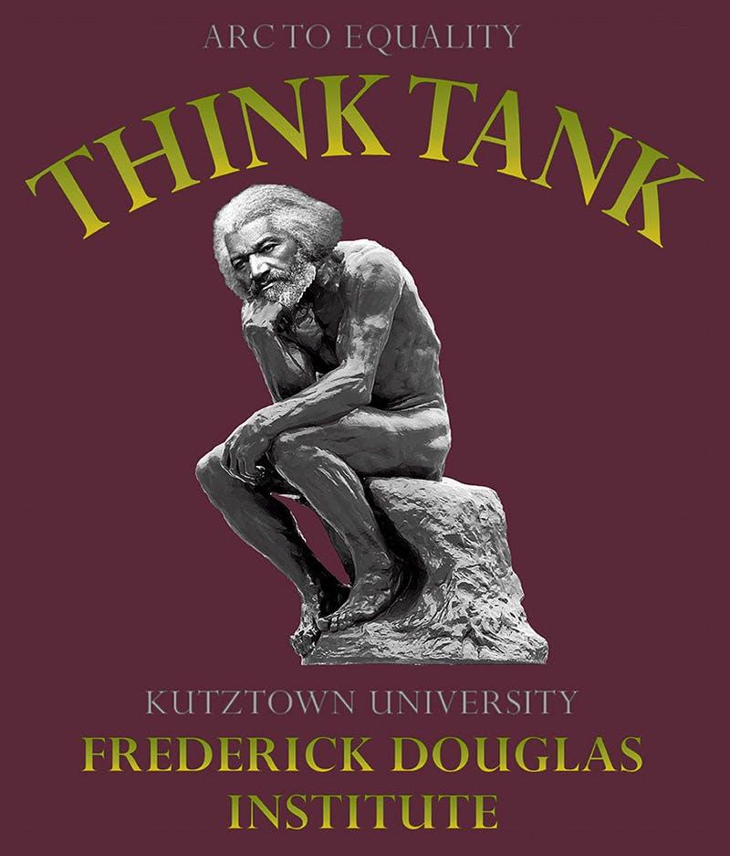
So what exactly did I do?
1. Found much better, high-quality images of Frederick Douglass and The Thinker.
2. Photoshopped his head onto the sculpture in an anatomically plausible way.
3. Adjusted the levels, contrast, and sharpness to look like a single image.
4. Re-typeset all the text to give it a more professional and classy look that made more sense.
5. Added a gradient of green ink to the yellow type for an extra touch of visual interest.
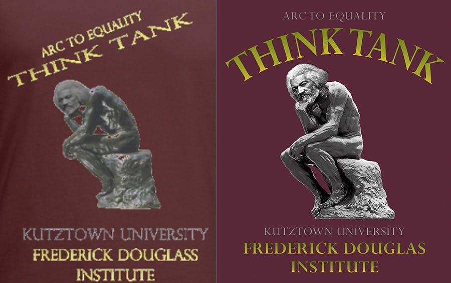
Customer approved. Design time: 45 minutes.
11. Unfulfilled
Our next example comes from an Amazon fulfillment warehouse in New Jersey. They ordered some baseball raglans with orange sleeves for a summer carnival event. Not sure what kind of carnival you could have at a fulfillment center, but ok. And yes, ABE8 is the name of it. Sounds more like a robot taking our jobs. Anyway, the design has some issues.
I'll go through them one by one, but first: what do you think the issues are?
Before:
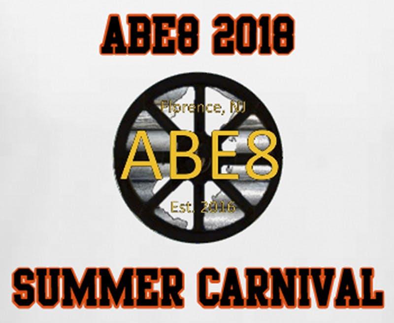
Here are the issues I noticed:
• The artwork is pixelated and low quality. Fuzzy edges and jaggy text. Lots of makeovers are initiated because of low-quality art files. In other words, if the artwork was printable, it may never have had a makeover proposed in the first place.
• The text needs typesetting. The collegiate font going straight across the top and bottom would normally be fine, but in this case, it makes the bottom line too long, throwing off the balance and print size. Also, the top "ABE8" is redundant.
• The center thing is hard to read. Not sure what's going on here. Some sort of wheel, the shape of New Jersey, and some kind of pipes in the background. Not a completely terrible design, but the low-quality art makes it all blob together.
So how do we fix it?
Another one that gets started from scratch. Nothing was usable. But the elements would be easy enough to recreate. I couldn't speak directly to the customer, so I never found out what the background pipes were (a good guess was those roller thingies they use to send boxes across a warehouse). But I got the go-ahead for a design makeover and was ready to deliver. Let's look at this prime example.
After:
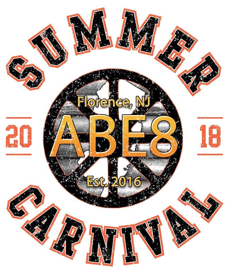
What did I do here?
• Cleaned up their image of the pipes/roller thingies and built the rest of the design on top of it.
• Removed the "ABE8" from the top line and split the "2018" across both sides of the center element.
• Took the words "SUMMER CARNIVAL" and arched them evenly on the top and bottom of the design.
• Recreated the inner elements, adding outlines to the New Jersey and wheel for improved contrast.
• Typeset the inner text, making it thicker, with an outline, highlight, and additional gradient blend.
• Made the design circular-shaped overall for a better fit on a baseball raglan print area.
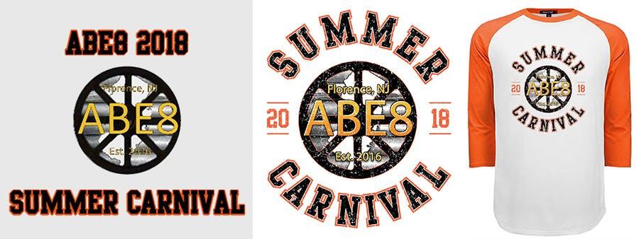
Customer approved. Design time: 45 minutes.
12. Hot or not?
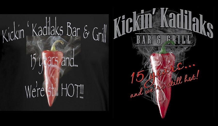
Here's one that came from a mom-and-pop bar and restaurant in York Haven, PA, which is out by Harrisburg, according to Google maps. This was obviously put together quickly in our Design Studio and has just two elements, the type and the photo of the pepper– a cayenne pepper, according to our resident expert on everything hot. But is the design hot?
I'll go through the various things that need improving, but before I do: what do you see that could use improvement?
After:
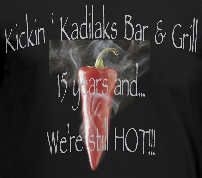
Here are the elements I flagged for improvement:
• The smoke is cropped off. It looks like the pepper is trapped in an invisible box. Not sure why it's smoking, but that smoke would look much better if it were flowing up and around the text or at least behind it. Speaking of the text…
• The text needs better typesetting. The slight arch adds some style, but it's not visually appealing. The apostrophe after kickin' is backward and trying to escape. The three exclamation marks!!! And then there's the font. Never use Papyrus.
• The tagline should be separate from the business name. You can do this using different fonts or colors; ideally, the business name would be a logo. Or, at the very least, a customized font, aka logotype.
So how do we fix these issues?
You are correct if you guessed that I needed to start from scratch. After speaking with the customer, a lovely woman named Pamela, I learned it was the 15-year anniversary of their little bar/restaurant, and the shirts would be worn by employees but also sold to customers. So they needed to be extra kickin' hot. She agreed to a design makeover, and I cooked it up. Here's a taste of this example.
After:
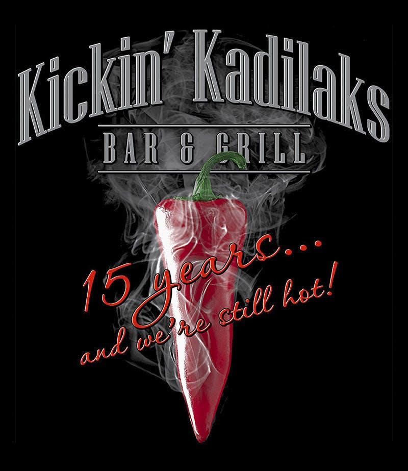
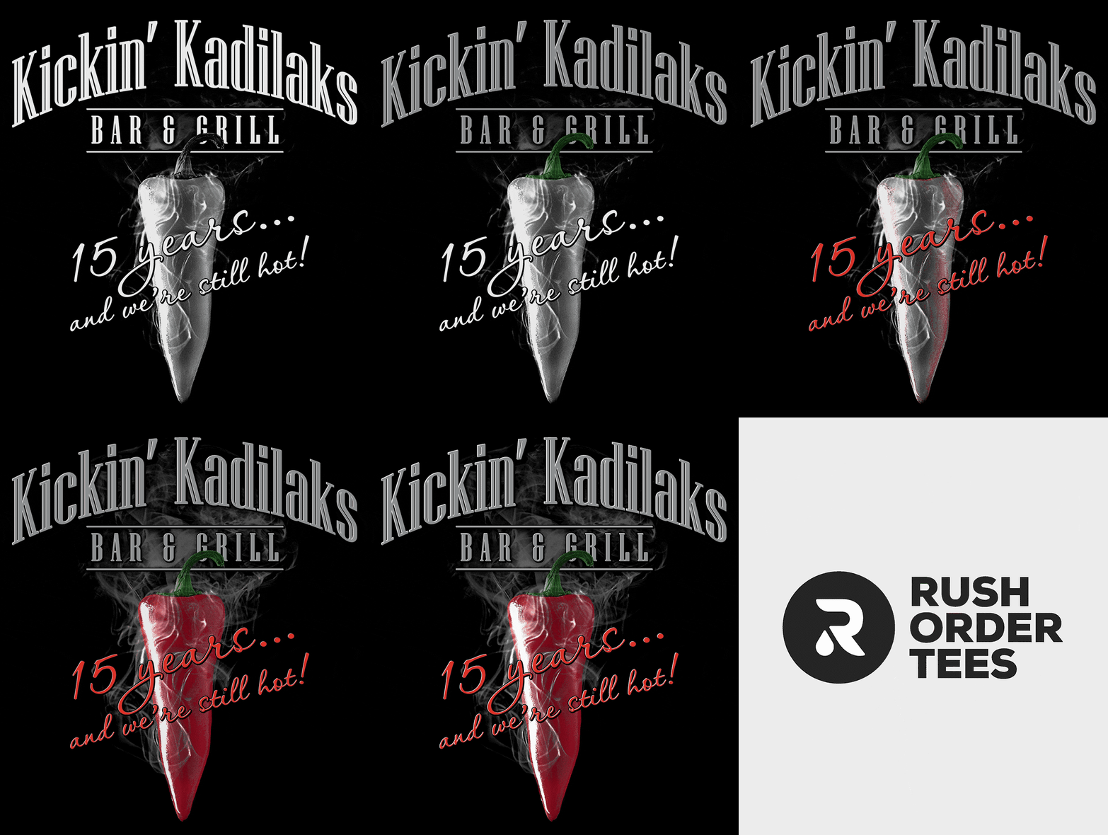
So what did I do?
• Found a high-resolution version of the cayenne pepper online and bought the stock photo.
• Added some additional smoke to go up behind the type and blended it in with the rest.
• Chose two fonts for the restaurant name and designed a custom logotype for them.
• Chose a third font– scripty and much different than the others– to use for the tagline.
• Added a highlight and shadow to all the type to give it some dimension and pop.
• Photoshopped the pepper in front of the logotype to give it even more depth.
Finally, this is a 7-color "simulated process" print, so a great separation was needed. I was already using Light Gray for the smoke, but I wanted the gray type to stand out– how about metallic Silver? Oh yeah.
Then I used a brighter red (just a bit towards the orange side of the spectrum) for the “15 years…” type, so it would stand out against the deeper red of the pepper. Here's a print preview GIF showing the layers of halftones and the color order of the screens:
Who doesn't love before and afters?
Customer approved. Design time: 60 minutes.
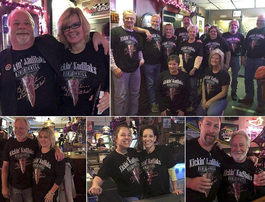
Followup on this makeover: A week after receiving their initial order of 100 T-shirts, they put in a reorder for 600 more. And that is the best compliment anyone can give us. They loved the design, loved the print, and loved the customer service. They even posted a bunch of photos showing staff, friends, and family looking hot in their new tees.
13. Lab Life
This example comes from a lab technician who orders shirts for her entire staff every year, usually with a funny or cute saying having to do with science or working in a lab. She told me they always come up with a bunch of ideas and then take a vote for their favorite design. You could say it's peer-reviewed.
Unfortunately, the image file for this particular year didn't pass our test. The tees she ordered were sport gray, and she wanted them printed in one color. I'm going to list the problems with this, but first– what do you see that needs to be fixed?
Before:
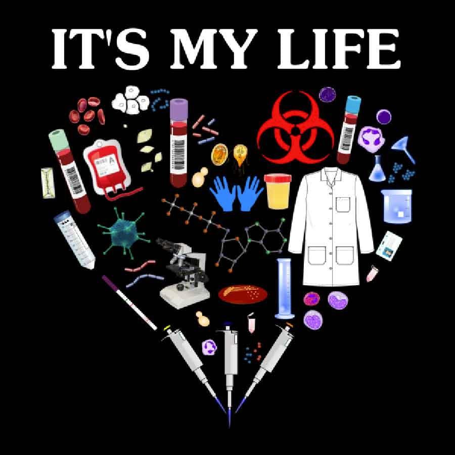
Here are the problems I saw:
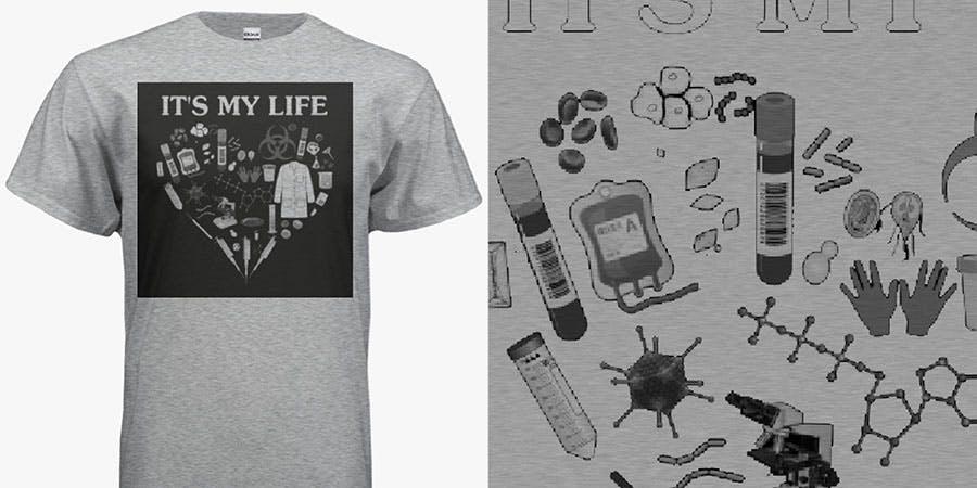
• The image quality is very low. Everything is pixelated to the point where many details are unrecognizable. What are the little floaty things? It could be red blood cells and bacteria. Or it could be jelly beans and earthworms. Who knows.
• The background is black. Sure, we could print it, but having a big black square on your shirt is not a good look (see the left side below). And the low image resolution makes removing the background difficult and would leave uggo halos (on the right).
• The visual weight of the items is inconsistent. Between the big lab coat and the thin molecules (or whatever), the shape is uneven and distracting. Squint your eyes, and you'll notice a hole in the heart. So sad. Nobody wants that.
This job is on the borderline: it could be called a design recreate rather than a design makeover. But in our internal parlance, a Recreate would involve diligently recreating each element. To save my sanity and avoid spending all day on it, I asked if she was okay with using different elements while keeping the theme.
She said go for it, so I put on my safety goggles and rubber gloves and started experimenting.
After:
What exactly did I do?
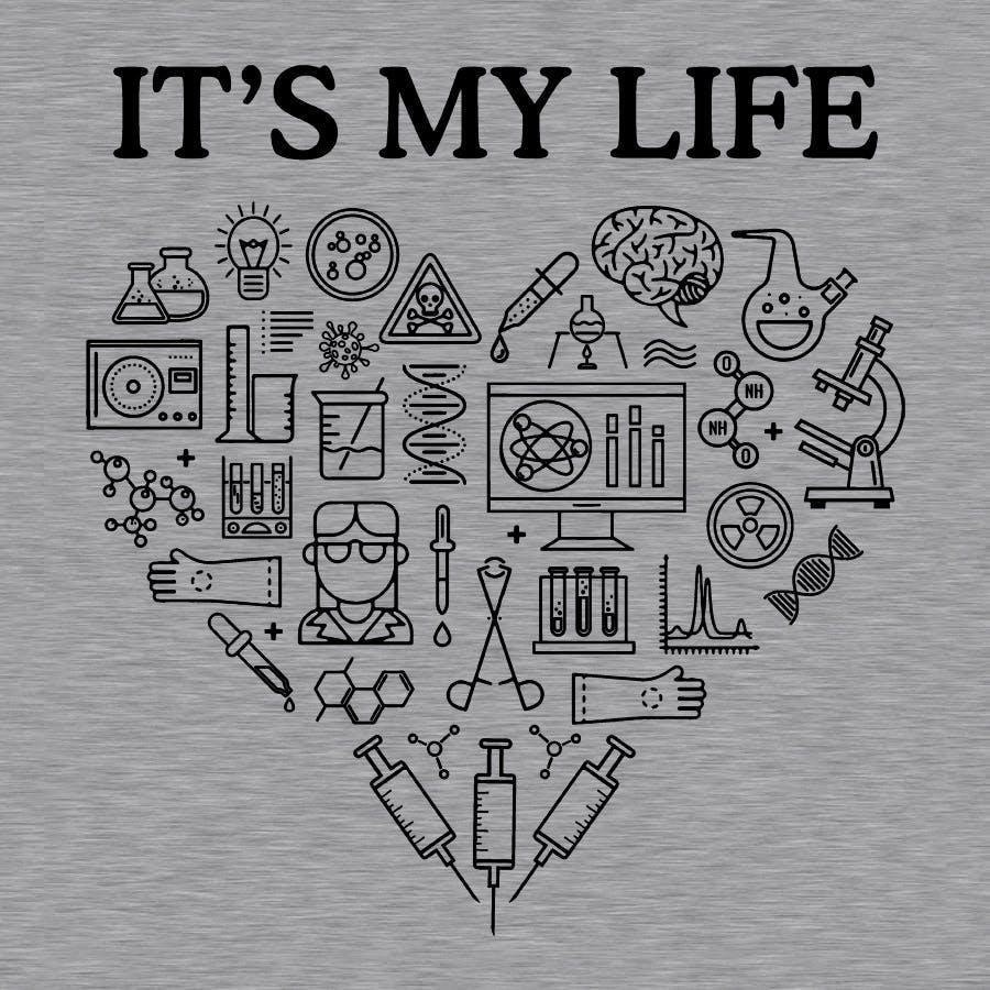
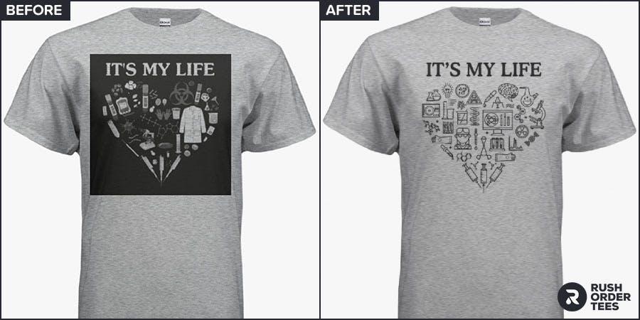
• Recreated the whole thing from scratch, using clip art from our collection and creating some of the items myself.
• Paid special attention to the visual weight of the elements (blur your eyes, and you see the whole heart shape).
• Kept everything outlines– nothing filled. This makes the print lighter and more flexible, plus keeping the consistency.
Customer approved. Design time: 90 minutes.
14. Roentgen is Rad
My second example comes from a student group from the CHCP in Texas who wanted to commemorate "Rad Tech Week" with some rad T-shirts. Rad Tech Week is short for National Radiologic Technical Week, which celebrates the discovery of the x-ray by Wilhelm Conrad Röntgen in 1895. It brings together two of my favorite things: science and parties.
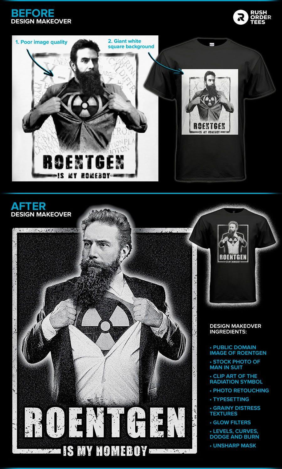
Unfortunately, the art file they submitted wasn't usable. The image quality was low, with a white background on black shirts. They seemed to be aware of this because they asked for a recreate before I spoke with them. They agreed to a design makeover, so I put on my hazmat suit, opened up Photoshop and Google, and got to work. Let's look closer at this glowing example.
What exactly did I do?
• Recreated the art with a public domain image of Roentgen, a stock photo of a man in a suit, and a clip art radiation symbol.
• Typeset the words in Illustrator and created the frame around the character to match the original artwork.
• Photoshopped everything together to make it look seamless, using the eraser, levels, curves, dodge, and burn.
• Added the grainy texture to give it a distressed look and added glow effects to give him radioactive powers.
Customer approved. Design time: 60 minutes.
15. Bagels & Brew… and Belly
This one involves a place where lab technicians go for breakfast: a New York bagel place. This mom 'n' pop shop in Queens was ready to take their business to the next level, but mom-and-pop were probably too busy making bagels and coffee to properly design a T-shirt. Below is the artwork they created.
I'll go through the various things that need work, but before I do: what do you see that could use improvement?
Before:
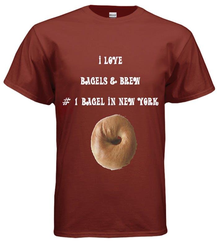
Here are the problems I flagged:
• It's the dreaded belly print. This happens when the main subject or weight of the design is placed below the chest area. The only thing worse than a belly print is if the image is round. And food. Bagels are meant to go in the belly, not on it.
• The bagel photo is low quality. It has jagged edges, missing parts and is pixelated– not yummy. Whoever removed the background selected too much, cutting into the edges of the bagel. The only thing cutting into a bagel should be a knife.
• The font choice is not appropriate. It's a little comical, a little fancy, and a lot wrong. It's also not the easiest to read, and the all-caps doesn't help. A font like this might look okay large, maybe just as a title– of a kids' TV show.
• The typesetting is non-existent. Typography is the art of arranging and setting type in an aesthetically pleasing way, conveys the message, and in this case, promotes the brand. Their layout is what it looks like when no effort is made. Just typed in. There's no change of font or of size, and the only visual hierarchy is the default way a stack of text is read.
So how do we fix these issues?
Clearly, I would want to start from scratch. After speaking with the owners, I learned that these were not just promotional tees– they were to be merch. This changes the equation, design-wise. They will not only ask people to promote their brand by wearing the shirt, but they'll also make them pay to do it. Superfans aside, this requires a different approach.
So they agreed to a design makeover, I put on my apron, poured some coffee, and got down to business. Bagel business.
After:
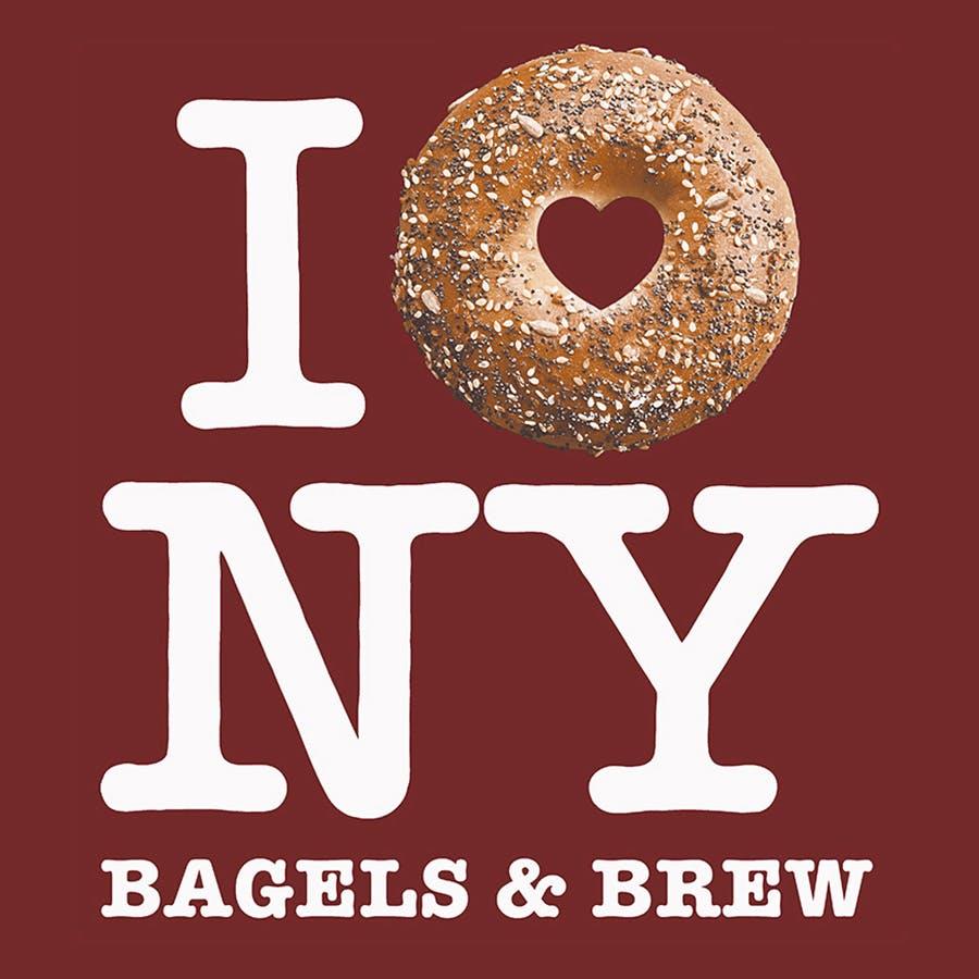
So what did I do?
• Found a high-quality stock photo of a yummy-looking bagel with everything on it. What are those called?
• Used Photoshop to replace the bagel hole with a heart shape to signify love, like the famous I (heart) New York design.
• Chose the same font as the original design and made the layout as close as possible, ensuring the reference was clear.
• Added the business name in smaller type, ensuring the brand was promoted and confirming the design is a parody.
• Moved their tagline to the back: "#1 Bagel In New York," along with the street address, phone number, and website.
• Created a color separation for screen printing with the sim process technique. We achieved this print with four colors.
I wanted to give them a fun, memorable, and visually pleasing T-shirt they could be proud to sell to their customers and something everyone would like to wear– not just their die-hard fans. By associating them with the iconic ad campaign, I wanted to suggest two things: their love for bagels and their love for New York. And yes, they loved the tees.
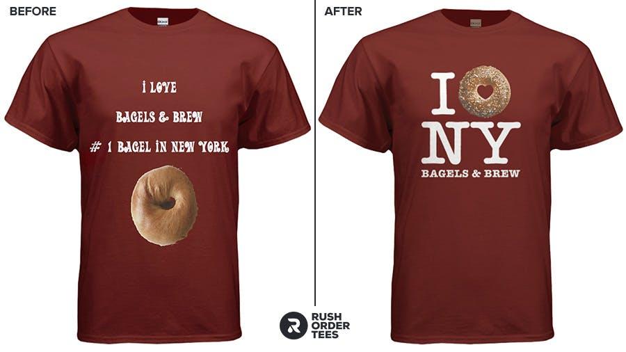
Customer approved. Design time: 60 minutes.
There you have it. Are you now inspired and ready to start your own design creation?
Whether you're interested in having apparel decorated with screen printing, direct-to-garment printing, or direct-to-film transfer, follow the above tips to make sure it will look its best.
Happy designing!

About the Author
A graduate of the Multimedia program at the University of the Arts in Philadelphia, Imri Merritt is an industry veteran with over 20 years of graphic design and color separations experience in the screen printing industry.
